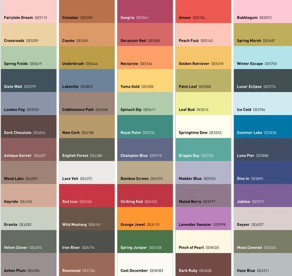

Dunn-Edwards Paints released it 2015 trend report, A Journey of Discovery, which reveals key colors and design trends we’ll see next year, and how social, culture and demographic changes influence these trends. Sara McLean, color expert and blogger at specs+spaces, explains that the color palette is rich in deep and vivid colors, inspired by adventure and discovery around the world. These five key trends will be significant influencers of colors and textures.
Romance and Remembrance is inspired by journeys into the past, filled with romance and intrigue. Envision traveling the Trans-Siberian railway or the Silk Road, or studying the rich tapestry of historical details through Renaissance to Medieval times, this trend returns to color and design that is familiar, yet with a modern day twist. The color palette creates a sense of history and solemnity with somber and serene neutrals such as chocolate, gray, soft green, mauve, pale pink and garnet, highlighted by whitened tones, sky blue and pale yellow.
Spirit of the West captures the freedom and romance of forging a new life in the American West. The artisan life is transformed by journeys to Latin and South America, Cuba and the Caribbean, bringing back design ideas from afar. The spirit of the West breathes life into emotional connections and ancient spiritual ways. Colors combine artisan style colors of red and rust with pigmented darks, dusky and very dark tones. Warm neutrals such as terracotta, green, ecru, tobacco and bronze round out the color palette.
Kaleidoscope provides journeys of travel to far-flung destinations with a focus on Brazil and South America, and to summer sun and surf. With glimpses at a variety of high-volume, frenetic lifestyles from street culture fans to night owls, club crawlers to sports fanatics and tech geeks, Kaleidoscope highlights pure joy. This color palette is on full display, filled with vivid brights and plant life coloring – vibrant, intense, with a touch of metallic.
L.A. Eccentricities takes us on a journey to the unique and quirky people and personalities of the City of Angels and the Southwest region — cheerful and festive, sentimental, hooked on fashion and trends, often with quirky and retro kitsch touches. Color is sugary-sweet with artificial goodness and pastel infusions. Highlights of citrus and berry add a layer of complexity.
Into the Abyss emerges as a story of sea, water and life in the Far East. From Japanese fishing villages to the fields of Vietnam, we journey on a learning curve into this world. With the upcoming 2018 Winter Olympics in South Korea and the 2020 Summer Olympics in Japan, influences of life lived beyond the Western world blossom. Layers of blue, from inky and deep ocean blues of the abyss to lighter sunlit blues are highlighted with accents of seaweed and sea life coloring.
To view or download the entire 2015 color and design trends report, visit specs+spacesor this Pinterest board.


